design system
The tokens, primitives, and patterns that build the realm. One world, one language.
{ color & surfaces }
Amber structures, cream informs, green invites, orange warns. Components use semantic roles, never raw hexes. The palette lives in globals.css; these swatches read the live tokens.
{ typography }
Five fonts, five jobs. Cinzel Decorative is only the site title. Cinzel heads panels and pages. Cormorant navigates and labels. Lora reads. Mystery Quest whispers.
Cinzel Decorative - site title only
Cinzel - headings, panel strips, page titles
Cormorant - nav, labels, metadata
Lora - body prose. The quiet workhorse at 17px, 1.7 line height, comfortable in long reads and short captions alike.
Mystery Quest - whisper lines, track titles, sign-offs
{ panels }
The specimen box is the core unit. Amber strip labels what is inside. Default moss for side rails, alt moss for primary content. InsetPanel is the recessed well you look INTO, not AT.
[ default panel ]
Deep moss body. Side rails, widgets, secondary content.
[ alt panel ]
Lighter moss. Primary page content steps forward.
[ with right slot ]
The strip carries a small metadata or action on the right.
InsetPanel: cassette windows, code, inputs. One level of recess is the whole trick.
{ buttons & links }
Amber fill is the main action, one per panel. Ghost is the secondary. Links navigate and glow green; buttons act. IconButtons always carry an aria-label.
{ badges & metadata }
Chips are the 90s web-badge look. Pills label expeditions and topics. Metadata rows orient the reader quietly, in uppercase Cormorant.
{ dividers & callouts }
Structural dividers split major regions, subtle ones separate dense content, the glyph is for storybook moments. Callouts hold the one sentence to remember; warning is the loudest voice in the realm.
{ media frames }
Images live in amber frames on deep moss. The corner tag is for a small decorative gif; captions stay quiet and italic.


{ form controls }
Every control has a visible label bound with htmlFor. Inputs sit in inset wells. Errors are described with aria-describedby and announced. Radios take the amber accent.
what should the realm call you?
the guestbook ink ran dry. try again.
{ states }
Empty, loading, error, and disabled are designed, not accidental. The EmptyState carries art and a whisper; the words stay factual.
~ watch your step! ~
this area is under construction. check back soon.
{ realm radio controls }
One transport language across widget, deck, dock, bar, and sheet. Play is always amber. Status is text plus LED, never LED alone. Demo is interactive but does not touch the real audio engine.
{ motion & access }
Animation is sparse: menu disclosure, player state, loading, small confirmations. Everything freezes under prefers-reduced-motion. Tab anywhere on this page: the green ring always shows where you are.
{ asset library: cabinet parts }
The notebook + cabinet hybrid family (design-kitchen/ASSET-SYSTEM-PLAN.md). CabinetIndex frames a set of DrawerFaces; every drawer shows number plate, label plate, caption, lamp, and decorative handle.
{ asset library: paper surfaces }
Physical paper: --surface-paper with dark ink, token-controlled texture. PaperSheet variants cover plain, aged, ruled, graph, log; stack/fold/torn are modifiers.
plain paper, stacked.
PaperSheet stackspiral notebook page, ruled.
NotebookSheet (ruled + spiral)engineering graph sheet.
PaperSheet variant="graph"log sheet with red margin.
PaperSheet variant="log"aged, torn edges.
PaperSheet aged torncatalog index card with metadata strip.
IndexCard meta + ruledrecipe card, pre-stained.
RecipeCardSurface (stained){ asset library: tabs & folders }
{ asset library: labels & stamps }
Stamp text stays editable (component, not baked). Baked wordmarks ship as SVGs. Tones map to status colors.





{ asset library: utility icons }
One sprite, one MossyIcon component, currentColor everywhere. Late-90s utility style at 16/20/24px.
{ asset library: technical icons }
The workbench set: machines, instruments, and honest outcomes.
{ asset library: stickers }
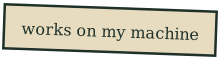
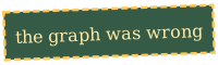
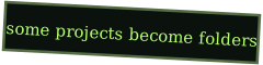
Flat SVG stickers in stickers/. Frog family, tiny objects, word banners. Upgraded painterly versions are briefed in design-kitchen/IMAGE-ASSET-BRIEFS.md.
 frog-desk
 frog-wrench
 frog-notebook
 frog-terminal
 frog-folder
 frog-radio
 tiny-rocket
 tiny-crt
 tiny-beige-pc
 tiny-gamepad
 tiny-cassette
 tiny-floppy
 tiny-gears
 tiny-satellite
 tiny-sign
 tiny-mug
 tiny-cable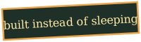
{ asset library: section marks }
One frame, four glyphs. The emblem for each wing, in the component and as static SVGs in section-marks/.
{ asset library: textures }
Tiny seamless tiles in textures/, layered via CSS with token-controlled opacity. Never full-screen, never blocking, always static.
{ asset library: interactive states }
Files report state by shape and mark, never color alone: hovered file slides 2px, active file stays open with amber plate and ►, focus uses the global green ring. Tab through the row.
DrawerFace default / active / lamp{ asset library: attachments }
Small paper hardware, absolutely positioned inside relative parents. All decorative.